Design for the phone in a WhatsApp thread
Almost every catalogue design mistake comes from designing on a laptop for something that will be read on a phone.
One product per page. A grid of six looks efficient and is unusable — she cannot zoom to one without losing the others, and she cannot tell you which one she means. One product, one page, one code.
Portrait, not landscape. A phone is held upright. A landscape catalogue arrives sideways or shrunk to a third of the screen.
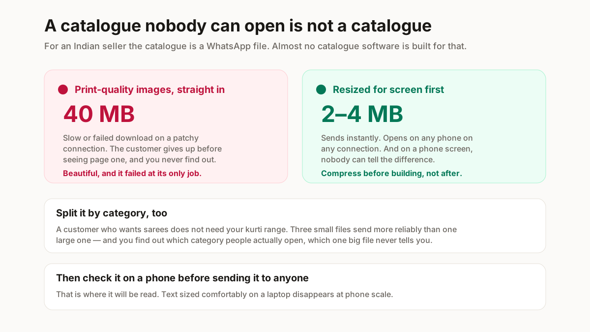
Type at least as large as it looks wrong on screen. What looks generously sized on a laptop is unreadable at phone scale. Check it on an actual phone before sending, every time.
Leave room around the product. Edge-to-edge photos crop unpredictably in WhatsApp’s preview and lose the part you cared about.
What must be on every page
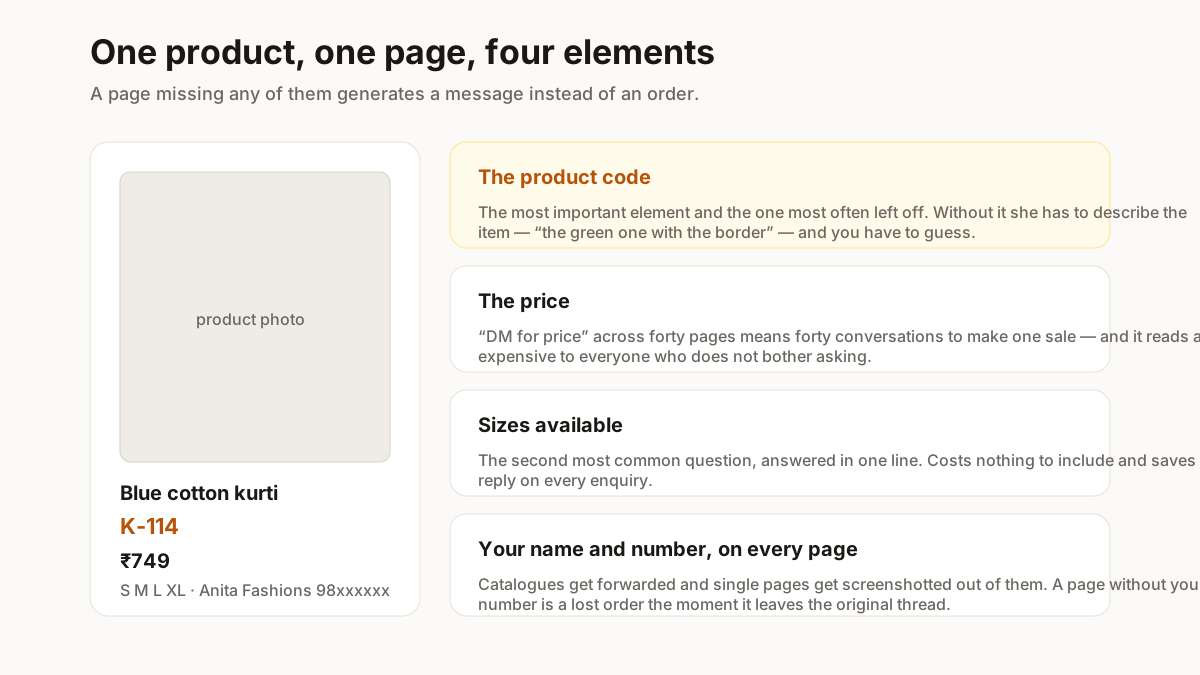
Four things. A page missing any of them generates a message rather than an order.
- The product code. The single most important element and the one most often left off. Without it she has to describe the item — “the green one with the border” — and you have to guess. A short readable code from your SKU generator turns a paragraph into three characters.
- The price. Yes, on the page. “DM for price” across forty pages means forty conversations to make one sale, and it reads as expensive to everyone who does not ask.
- Sizes available. The second most common question. Costs one line.
- Your name and number. On every page, not just the cover. Catalogues get forwarded, and single pages get screenshotted out of them — a page without your number is a lost order once it leaves the original thread.
How many products, and in what order
Fewer than you want to send, in an order you chose rather than the order they were photographed.
| Decision | What works | What people do instead |
|---|---|---|
| Products per file | 20–30 | The whole range, and nobody scrolls past 40 |
| Products per page | One | A grid of six, unusable on a phone |
| Orientation | Portrait | Landscape, made on a laptop |
| Opening pages | Best sellers | Newest, or whatever was photographed last |
| Grouping | By category, then colour | Warehouse order |
Twenty to thirty per catalogue is the working range. Past forty, people stop scrolling and the file gets heavy. If your range is larger, split by category — sarees, kurtis, suits — and send the one she asked about. Three focused catalogues outperform one exhaustive file, and you learn which category she opens.
Best sellers first. Not newest, not cheapest. The first three pages decide whether she reaches page twenty, so lead with what already sells.
Group by category, then by colour. Random order reads as a warehouse. Grouping reads as a shop.
Put the range you actually want to move in the middle third. Attention is highest at the start and recovers slightly at the end; the middle is where a well-placed item does its work.
Consistency beats design skill
The thing that makes a catalogue look professional is not layout talent. It is that every page looks like the others.
Same background, same distance, same light on every product photo. A catalogue of forty consistent phone photos looks more professional than twenty studio shots mixed with twenty taken on a bed.
Same position for the code and price on every page. The eye learns where to look by page three and stops hunting.
Same typeface throughout. One is enough.
This is also why the catalogue is worth rebuilding rather than appending to. A file with this season’s pages bolted onto last season’s looks exactly like what it is. Resize the batch in one pass with the bulk resizer, then generate the whole thing fresh.