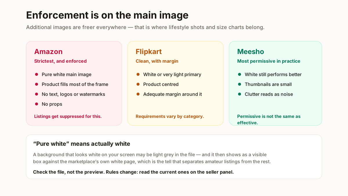
Remove, replace or clean
Deciding which one you need takes ten seconds and saves the re-edit.
Remove produces a transparent PNG with nothing behind the product. Useful as an intermediate step, or when the image will sit on a coloured page you control. On its own it is rarely the finished asset — most places you upload it will render the transparency as white anyway, or as black, which is worse.
Replace is what marketplace listings need: cut out the product and put pure white behind it. This is the default for any main catalogue image, and it is what our background remover outputs.
Clean keeps the original background and fixes what is wrong with it — the cable in the corner, the fold in the sheet, the uneven patch of shadow. For lifestyle photos, Instagram, and anything where the setting is part of the appeal, this is right and removal is wrong.
The common mistake is reaching for removal when the photo needed cleaning. A model shot with the room cut away looks like a sticker.
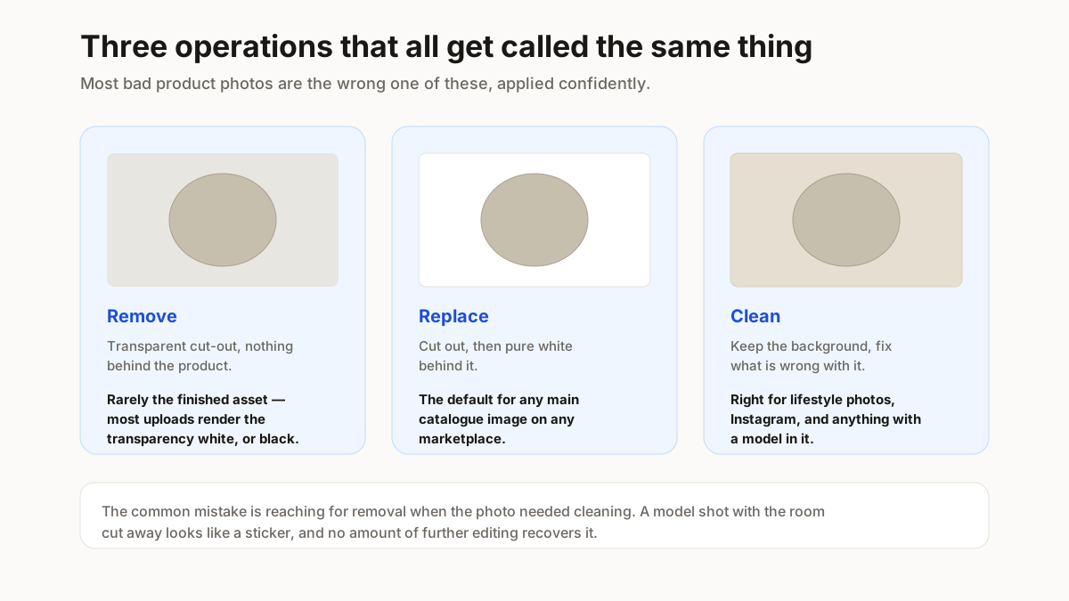
What the marketplaces actually require
Rules vary by platform and category, and the enforcement is on the main image rather than every image.
| Platform | Main image | Enforcement |
|---|---|---|
| Amazon | Pure white, product fills the frame, no text, logos, watermarks or props | Strict — listings get suppressed |
| Flipkart | Clean white or very light, product centred with margin | Varies by category |
| Meesho | White not mandated, but it wins in a small thumbnail | Most permissive in practice |
Amazon publishes its image requirements in Seller Central at sellercentral.amazon.in, and Flipkart in the seller portal at seller.flipkart.com. Both change by category, so read them there rather than trusting a table — including this one.
“Pure white” means actually white, not near-white. A background that looks white on your screen may be light grey in the file, and it shows as a visible box against the marketplace’s own white page. Check the file rather than trusting the preview.
Additional images are freer everywhere — that is where the lifestyle shots, the detail crops and the size charts belong.
What goes wrong, and why
Four failure modes account for most bad cut-outs, and three of them are about the original photo rather than the editing.
- Hair, lace, net and fur. Fine detail against a busy background is the hardest case for any tool. Shoot these against a plain wall to begin with and the problem mostly disappears.
- The product matches the background. A white kurti on a white sheet has no edge to find. Shoot light products on a mid-grey surface and dark ones on light.
- The shadow gets taken too. Removal cuts contact shadow along with everything else, and the product then floats. A small soft shadow under the product reads as real; none at all reads as pasted.
- Blown-out edges. Over-exposing to force a white background eats the outline of a light product. Expose for the product, whiten afterwards.
The general rule: an extra minute arranging the shot saves ten minutes of edit and produces a better result than any amount of correction.
Doing it in bulk without inconsistency
Catalogues are judged on consistency, so the batch matters more than any single image.
Shoot the whole batch in one session, same surface, same light, same distance. Backgrounds edited from consistent originals come out consistent; edited from mixed originals they do not, however good the tool.
Do the background first, then resize. Resizing a cut-out is lossless in the ways that matter; cutting out an already-resized image throws away the edge detail you needed. Run the batch through the bulk resizer after, once every image is on white.
Keep the originals. Marketplace requirements change, and re-editing from a processed file compounds every artefact.
Spot-check at thumbnail size. Most background errors are invisible at full size and obvious at 200 pixels, which is the size customers see first.